Fundamental UX laws that will help you improve your skills as a UX designer.
A primer on a few UX Design principles that every designer and developer should be familiar with.
People frequently generalize UI/UX design as "making screens nice" when the topic is brought up. However, that is utterly untrue. Laws and principles define and control design decisions, just like in any other profession. Every screen you see has a purpose, as do all of the minor components on it. When it comes to improving the user experience, there are no set standards that must be followed. However, there are several laws and principles based on typical human psychology and behavior that can direct a designer toward creating an effective and useful interface for a better user experience.
The Laws of UX are a collection of best practices that designers can consider when building user interfaces. — Jon Yablonski
UX is not (only) UI. Good designs tend to follow a general set of principles, namely the Ten Principles for Good Design by Dieter Rams, that give designers general guidelines to work with. But for interface designers and user experience professionals, there are certain laws that everyone should keep in mind while designing.
I examined a few laws in this article, and, from my perspective and comprehension, I've explained them with examples. Check this out;
Fitts’ Law
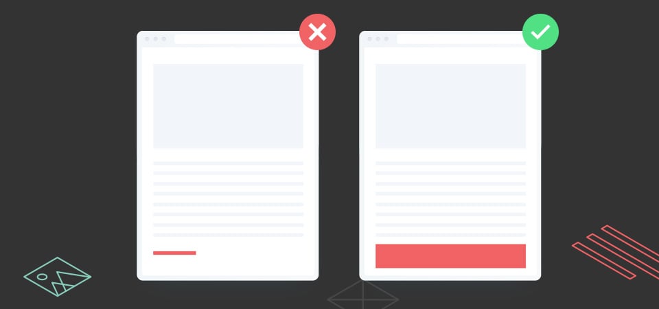
Fitts’ law states that the amount of time required for a person to move a pointer (e.g., mouse cursor) to a target area is a function of the distance to the target divided by the size of the target. Thus, the longer the distance and the smaller the target’s size, the longer it takes.
_ Paul Fitts
Fitts' Law is a rule of thumb in human-computer interaction that explains that the size of the clickable target and the distance between the starting position of the pointer and the target have an impact on how long it takes a person to click on a particular spot on a computer screen.
Alternatively phrased, the bigger and closer a target is, the quicker someone will click on it.
Fitts' Law can be used in user interface design in a few different ways, as shown by the following examples:
The main navigation links should be large and easy to click on when building a website because they are likely targets that users will want to click on frequently.
The buttons for common actions, such as "send" or "delete," on a mobile app should be large and easy to tap so that users can complete these actions quickly.
It is important to make the submit button big and easy to click on so that users can easily submit the form when they are finished when creating a form.
The buttons for important actions, such as "jump" or "shoot," should be easy to reach and click on, so that players can respond quickly to in-game events.

When designing user interfaces (UI), designers should keep this in mind since if it takes too long for consumers to click on components, they can get frustrated and give up. Designers may make sure that their interfaces are simple to use and effective for users by adhering to Fitts's Law.
- Hick’s Law
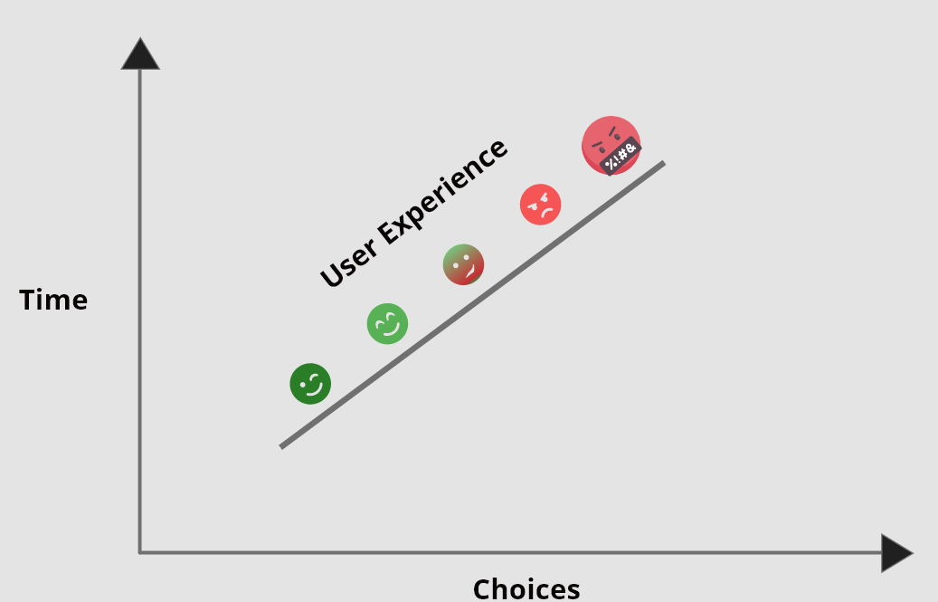
The Hick-Hyman Law, commonly known as Hick's Law, is a psychological principle that states that the more options someone has, the longer it will take them to decide.
To put it another way, it might be challenging for people to choose what to do when they have too many options.
This is a key fact for designers to keep in mind when building user interfaces (UI), as giving users too many options might make them feel overwhelmed and confused. Hick's Law teaches designers how to create user interfaces that are simple to use and effective.
A few instances of how Hick's Law could be used in user interface design are given below.
Be sure to keep the main navigation simple, with only a few links, so that users can easily find what they are looking for.
It is best to keep the number of options in each menu to a minimum, so that users can easily find what they need.
It is mportant to ask only for the necessary information, rather than overwhelming users with too many questions.
Give players only a few options at a time in a game system, so that they can focus on the task at hand and not get overwhelmed.

Simply put, people will take longer to make a decision the more options there are for them to consider. Here, simplification of the decision-making process is the goal rather than its total elimination. As a designer, keep things simple and periodically draw attention to the key or desirable options to aid consumers in making decisions more quickly.
- Miller’s Law
Miller's Law, a psychological theory, states that, the average person can only retain roughly seven items of information at once.
In accordance with the belief that the human brain has a finite capacity for short-term memory, this is referred to as the "magical number seven."
When developing user interfaces (UI), designers should keep this in mind since if there is too much information on the screen, people may find it overwhelming and perplexing. Following Miller's Law will help designers create user interfaces that are simple and effective.
Here are a few examples of how Miller's Law might be applied in user interface design:
When designing a website, it is important to keep the main navigation simple, with only a few links, so that users can easily find what they are looking for.
Building a mobile app, it is best to display only a few options at a time, rather than overwhelming users with too many choices.
It is important to ask only for the necessary information when you'recreating a form, rather than overwhelming users with too many questions.
Phone numbers are a fantastic illustration. It would be difficult and take a lot of time to recall simply 1244987840. However, if you split it into smaller groups, like 1244-987-840. Tell me if remembering this is still challenging. I don't believe so.
Similarly, in digital interfaces, grouping or chunking makes it easier for the users to remember things for later use. Like, E-learning websites, etc.
- Tesler’s Law
Tesler's Law, often known as the Law of Conservation of Complexity, is a notion in computer science and user experience (UX) design that states that there is a certain amount of complexity that can be efficiently controlled by the user for any system.
In other words, there is a limit to how much complexity a person can handle at once.
This is vital for designers to bear in mind when building user interfaces (UI), because a complicated interface can be overpowering and confusing for users. Designers may ensure that their interfaces are simple and easy to use by following Tesler's Law.
Some procedures simply cannot be made simpler or more elementary. A system undoubtedly has complications that are just waiting to be taken up by the user or the system. However, as the system, it is our duty to lessen user complexity. By addressing inherent complexity throughout design and development, it is always essential to make sure that users are relieved of as much of the strain as possible.
Here are a few examples of how Tesler's Law might be applied in user interface design:
When designing a website or app, it is important to keep the interface simple and easy to understand, so that users do not become overwhelmed by too much complexity.
When creating a form, it is important to ask only for the necessary information, rather than overwhelming users with too many questions or options.
In a game, it makes more sense to gradually introduce new elements and challenges, rather than overwhelming players with too much complexity at once.
The objective should be to eliminate any potential for a major penalty while reducing functionality without altering the website's look.
Make an effort to include user preferences so that certain selections are understandable to the user.
By outlining the options required to finish a task, you can cut down on the number of distracting components.
- Zeigarnik Effect
According to research, the Zeigarnik Effect is a psychological phenomenon that shows that we are more motivated to accomplish a task once we start it. This can be advantageous for UX design since it can motivate customers to continue using a good or service. For instance, if a person starts filling out a form on a website but doesn't finish it, they could be more inclined to do so later since they don't want to abandon the assignment. Businesses may benefit from this, as it keeps customers interested in their goods or services.
When you begin something but don't finish it, thoughts of the unfinished job keep coming to mind even after you've gone on to other things. The Zeigarnik effect is employed in a variety of ways to draw users' attention to unfinished work.

The screenshot above shows the process for finishing an Instagram profile. This has been developed in such a way that it sometimes prompts users to finish their profile sections by pointing them in the proper direction. When you "leave undone" some activities, your internal process wants to finish them, but you also have that feeling telling you they are unfinished.
Conclusion
It's critical to realize that your eyes and ears sometimes fall short of conveying what you can perceive.
Designers need to keep this in mind when they consider perception and imagination and work to connect the two using UX laws. There are several UX laws that must be followed in order to create better user experiences, some of which were already mentioned above.
Visit LawsofUX to learn more about UX laws. I sincerely hope I was able to provide you with some further insight into these laws.
How did it feel to learn about these laws?
Please feel free to contribute your thoughts and offer your perspective.
Thank you for your time.
References
https://www.interaction-design.org/literature/topics/hick-s-law
https://lawsofux.com/millers-law/
